A few months ago I had paint samples taped across three different walls in our living room and honestly none of them looked the way I expected. One shade looked soft and warm in the store, then suddenly turned gray and dull once it was on the wall at home. Another looked almost orange by evening. After repainting more than one room over the years, I’ve learned that trends only matter if the colors actually work in real homes with real lighting and daily mess.
The interesting thing about 2026 paint color trends is that they feel calmer and easier to live with. There are still bold colors around, but most shades lean warmer, deeper, and less perfect looking. A lot of them feel like colors people can actually keep for years without getting tired of them after one season. Some surprised me once I tested them properly. Others looked beautiful online but felt too heavy after a few days. That’s probably normal.
1. Warm Browns Are Everywhere Again :
Warm brown shades are coming back in a much richer way than before. Think walnut, coffee, caramel, and tobacco tones instead of the flat muddy browns from older homes. I painted a small study wall in a deep coffee shade recently and the room immediately felt calmer.
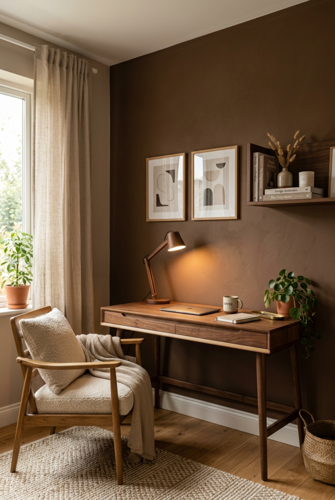
The only thing is dark brown absorbs more light than people expect. In smaller rooms it can start feeling heavy unless there’s decent lighting nearby. Still, these shades hide marks surprisingly well, which matters more than people admit.
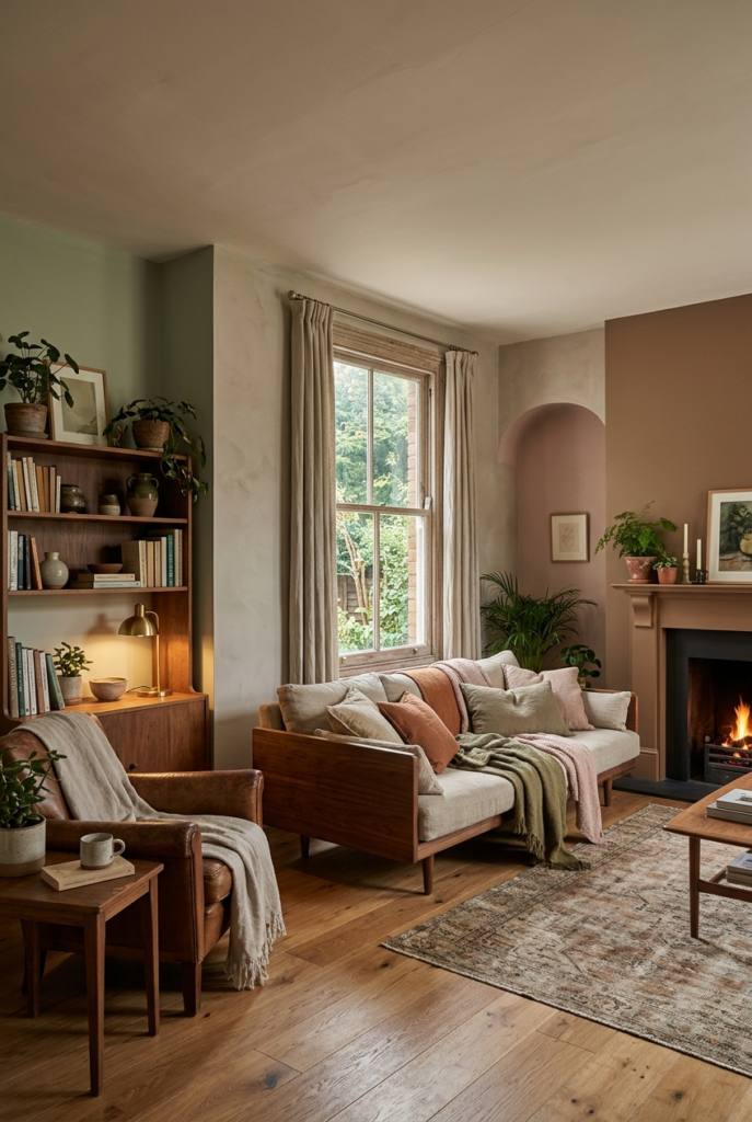
2. Dusty Pink Feels More Mature Now :
The newer dusty pink shades barely look pink once they’re fully painted. They sit somewhere between neutral and soft color. I tested one in a bedroom and it made the room feel quieter without looking overly styled.
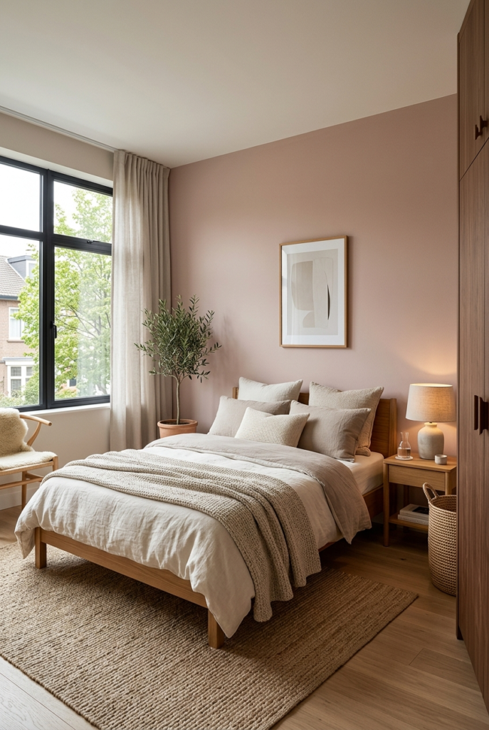
In very bright afternoon light though, some dusty pinks can lose depth and start looking washed out. Textured fabrics nearby helped fix that a little.
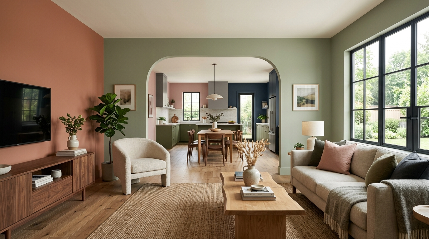
3. Forest Green Is Moving Beyond Accent Walls :
Deep greens are showing up in full rooms now instead of just one feature wall. Forest green, pine, and darker olive shades are becoming common in offices, hallways, and bathrooms.
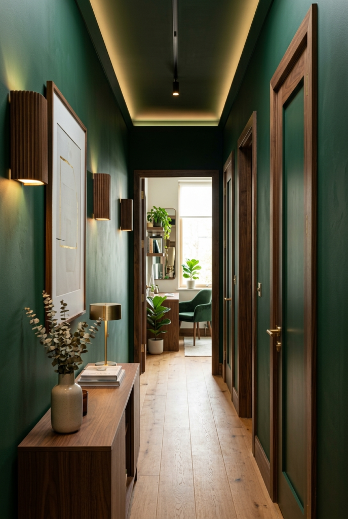
I tried one in a narrow hallway and liked the mood it created, but I underestimated how much darker the space would feel at night. We ended up adding another wall light after a week.
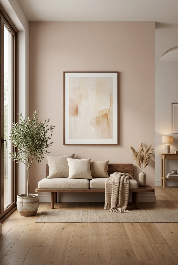
4. Creamy Off Whites Are Replacing Bright White :
Bright cold white paint is slowly fading out. Softer whites with cream or beige undertones feel easier on the eyes and work better with wood furniture and warmer lighting.
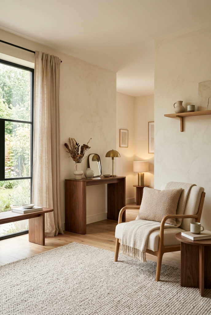
I switched our trim from pure white to a warmer off white and the entire room looked less sharp and sterile. The difference sounded minor on paper but felt obvious once everything was painted.
5. Terracotta Is Looking Softer :
Terracotta tones still exist, but they’re less orange now. The newer versions lean closer to clay, rust, and faded brick shades.
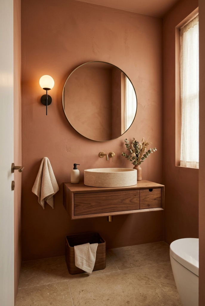
I painted a small powder room in muted terracotta and ended up liking it more than expected. It felt warm without screaming for attention. Lighter terracotta shades can show dust faster though, especially near lower walls.
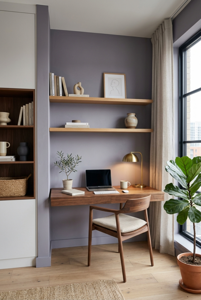
6. Stone Gray Is Replacing Cool Gray :
The cold blue gray trend is finally slowing down. In its place are softer stone and mineral grays that feel less icy.
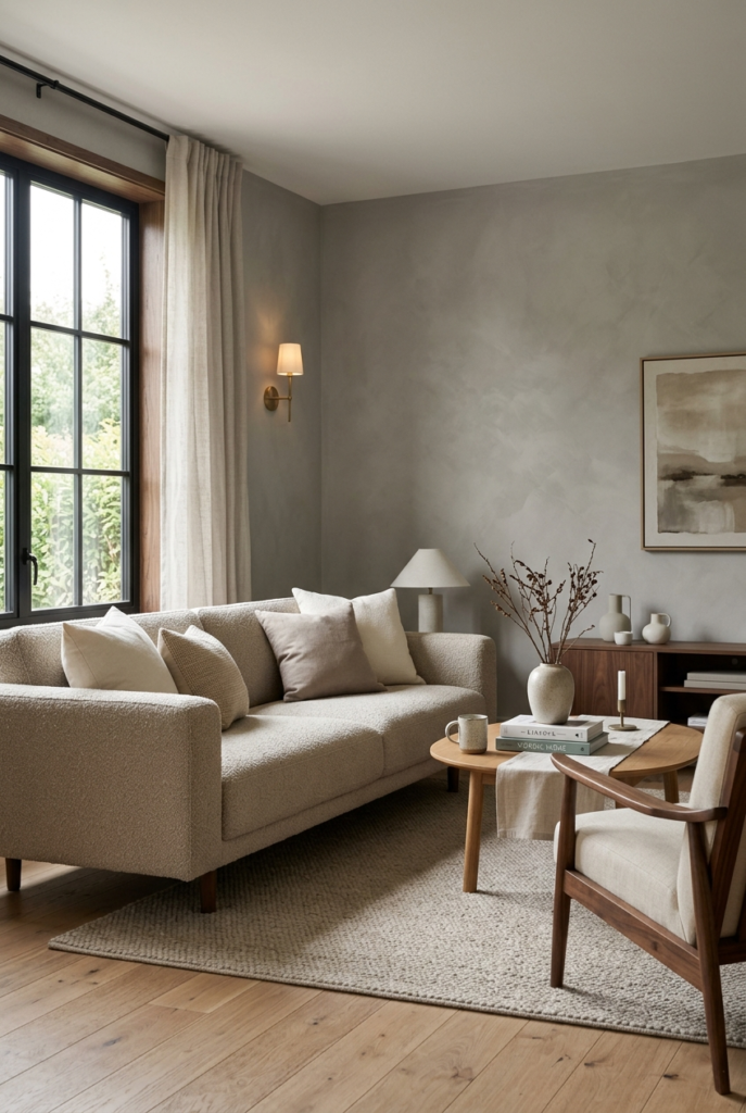
I tried one in a sitting area and noticed it blended better with natural wood and warm lighting. The room felt quieter without looking overly modern.
7. Sage Green Is Still Staying Around :
Sage green refuses to disappear, but the newer shades are slightly deeper and less pastel looking. It still works well in reading corners, bedrooms, and kitchens.
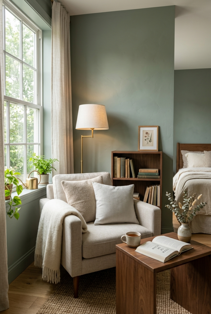
What I like about sage is that it changes depending on the furniture around it. Sometimes it looks green, sometimes almost gray.
8. Muted Mustard Is Showing Up Slowly :
Soft mustard and ochre shades are appearing in smaller spaces instead of whole open rooms. I was doubtful about this trend at first because mustard can easily feel too heavy.
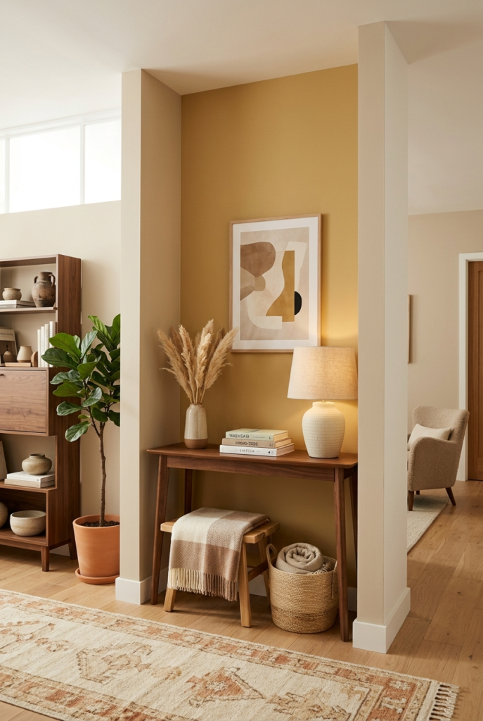
After testing a muted version on a small wall though, it actually looked warmer and calmer than expected. I still wouldn’t use it everywhere.
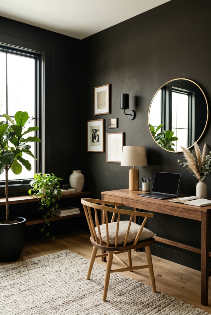
9. Charcoal Rooms Feel More Common :
People are getting more comfortable using charcoal paint across full rooms now, including ceilings in some cases.
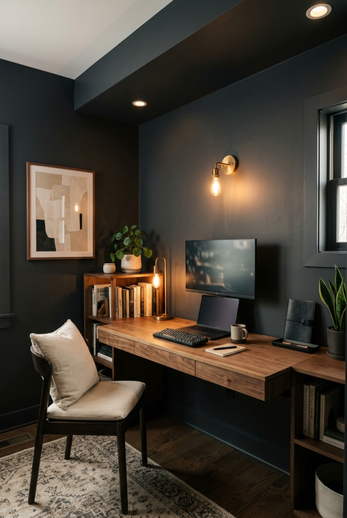
I tried charcoal in a small office space and at first it honestly felt like a mistake during the daytime. Once lamps and warmer bulbs were added, the room started feeling more intentional and comfortable.
10. Burgundy Is Making a Quiet Comeback :
Deep burgundy and wine shades are returning, especially in dining spaces and smaller rooms.
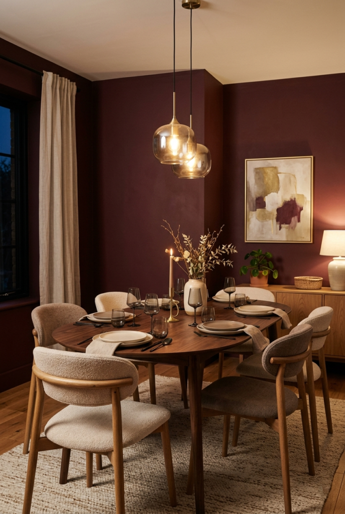
These colors look rich in evening lighting, but they need confidence. Half painted walls or tiny sections sometimes make them feel awkward instead of dramatic.
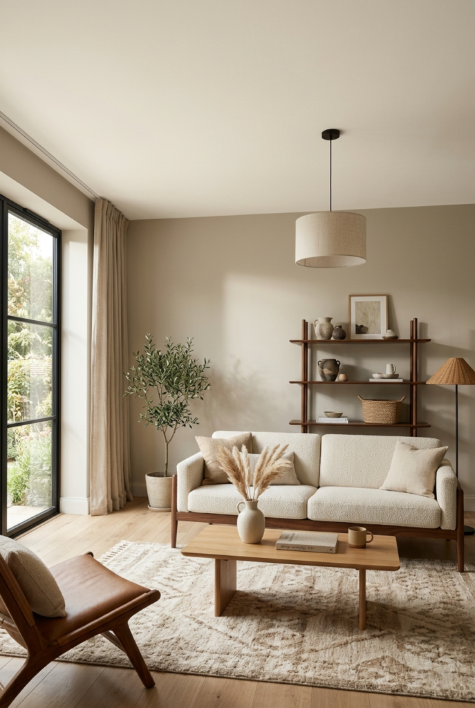
11. Greige Is Becoming More Natural Looking :
Greige is still popular, but it now leans warmer and softer. The newer shades mix beige, taupe, and slight pink undertones instead of looking flat gray.
I used a putty toned greige in a main living space and noticed it handled changing daylight better than cooler neutrals.
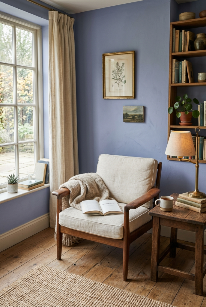
12. Lavender Is Appearing in Unexpected Spaces :
Muted lavender is quietly moving into offices, kitchens, and even bathrooms. Not the bright purple versions from years ago though.
I tested a dusty lavender in a workspace and it somehow made long work hours feel less tiring. I thought it might look childish but the gray undertones balanced it.
13. Navy Blue Still Works :
Navy blue never really disappeared, but now it’s paired with warmer woods and softer textures instead of crisp white everything.
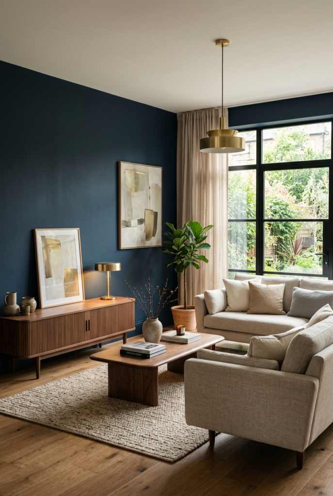
A navy wall can still look beautiful, especially in rooms with decent sunlight. In darker spaces though, it can quickly start feeling heavier than expected.
14. Dark Ceilings Are Becoming Less Rare :
One trend that surprised me most is darker ceilings. Chocolate brown, espresso, and charcoal ceilings are showing up more often.
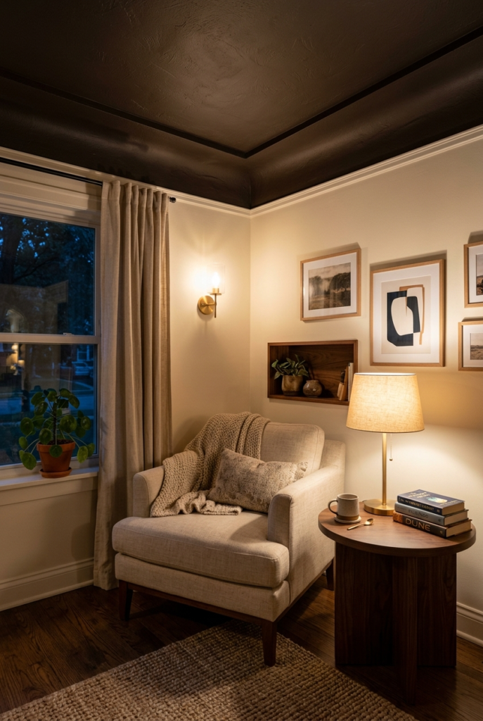
I tested a dark ceiling in a small sitting area and spent two days thinking I ruined the room. After adjusting the lighting, it actually became one of the coziest corners in the house.
15. Olive Green Is Getting Richer :
Olive shades are moving darker and earthier. These tones look especially good near natural wood furniture.
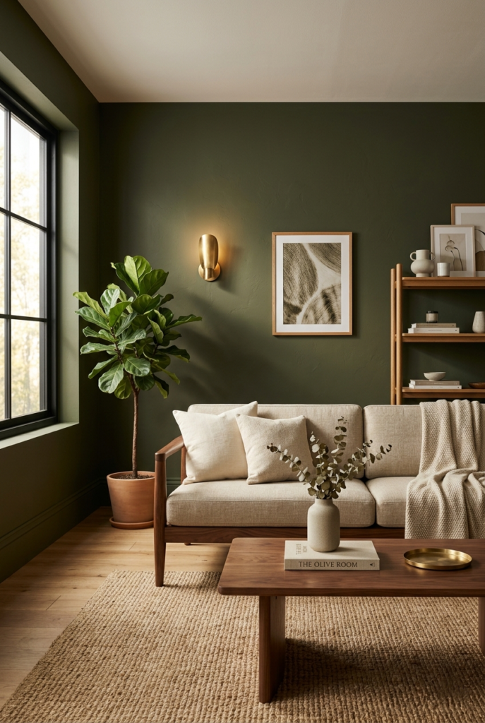
Very dark olive can sometimes lean military looking if there’s too much gray in it, so warmer versions usually feel easier to live with.
16. Soft Blush Is Moving Into Living Areas :
Muted blush tones are no longer limited to bedrooms. Softer versions are appearing in entryways and living rooms too.
From far away they almost read as warm neutrals instead of pink. That probably explains why more people are comfortable trying them now.
17. Inky Blues Work Well in Small Rooms :
Very deep blue shades that almost look black are becoming popular for powder rooms and compact spaces.
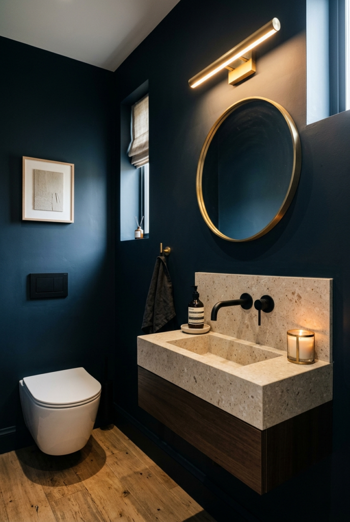
I tried one in a tiny bathroom and it somehow made the room feel more finished instead of smaller. Small rooms handle dramatic colors better than most people expect.
18. Warm Black Feels Softer Than Pure Black :
Instead of harsh cool black paint, people are choosing blacks with brown or green undertones.
They still feel bold, just less sharp. I currently have a warm black sample painted near a window and it changes a lot throughout the day.
19. Pale Aqua Is Returning Carefully :
Soft aqua and faded teal shades are quietly returning, mostly in bathrooms and laundry spaces.
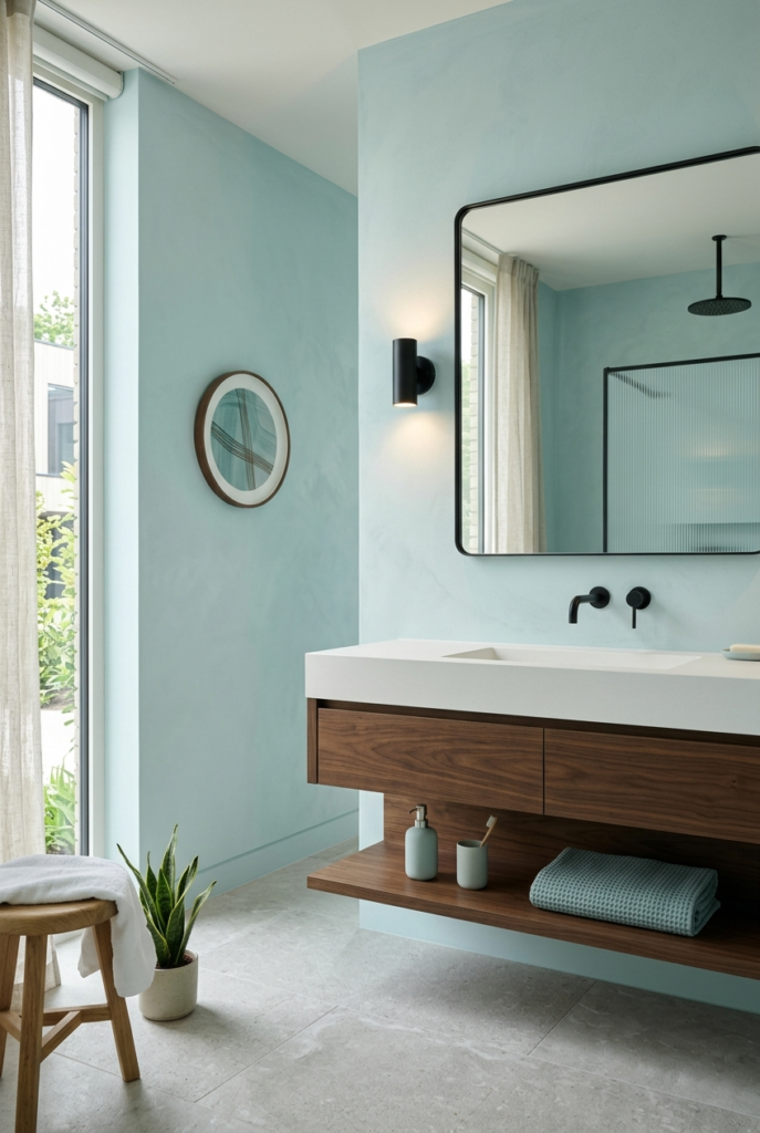
These colors brighten a room without feeling icy. In larger spaces though, they sometimes need darker furniture nearby or the room can start looking too pale.
20. Rust Tones Bring More Personality :
Rust and burnt orange shades are showing up as statement colors again.
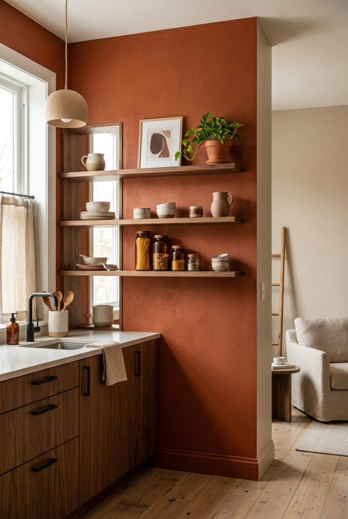
I added a rust painted section near the kitchen shelves and my opinion changes depending on the day. Sometimes it feels energetic. Other times it feels louder than I planned. Still, it never feels boring.
21. Faded Periwinkle Feels Lived In :
Soft periwinkle shades with dusty undertones feel relaxed and slightly vintage.
These colors don’t scream for attention. They just quietly soften a room over time, especially in spaces with older furniture or textured fabrics.
22. Warm White Ceilings Feel Better Than Stark White :
Even ceilings are shifting warmer now. Warm whites make rooms feel softer compared to the sharp bright whites that dominated for years.
Once we repainted our ceilings in a softer white, the entire house looked more connected without anyone immediately noticing why.
23. Earthy Purple Tones Are Slowly Growing :
Muted purples mixed with brown or gray undertones are becoming more common in smaller spaces.
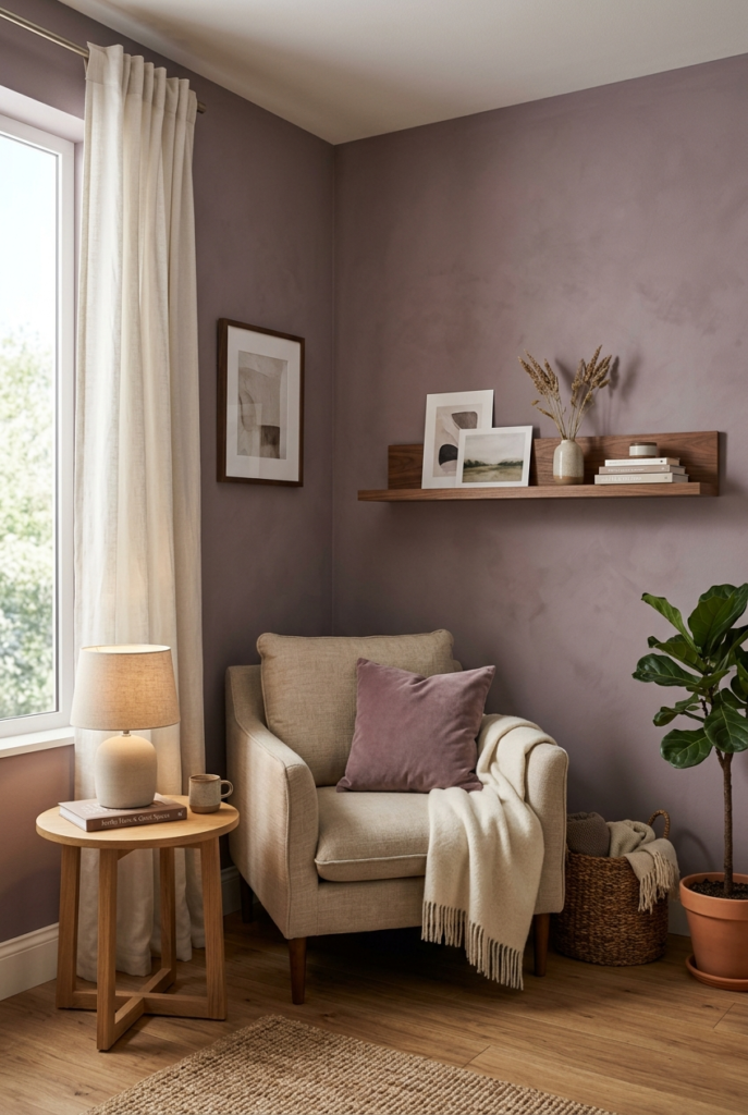
I sampled one recently expecting to hate it, but it ended up feeling surprisingly calm and grounded instead of dramatic.
Conclusion :
What I like most about 2026 paint color trends is that they don’t feel obsessed with perfection. The colors are warmer, moodier, and easier to actually live with day after day. A lot of them work better with normal lighting, worn furniture, and homes that aren’t styled like showrooms.
Not every trend worked in my own space. Some colors looked better online than they did on real walls. Others needed extra lighting or a second coat before they finally settled properly. That’s part of the process honestly.
In the end, paint trends matter far less than how a room feels when you walk into it every evening. The best color is usually the one you still enjoy after the excitement of repainting wears off.