Pantone named Cloud Dancer as the color of the year 2026 and honestly the choice made sense right away. It is not the harsh white that shows up in ultra modern spaces. It feels softer and a little warmer, which makes it easier to live with every day.
What surprised me most was how different it looked depending on the room. In some spaces it felt calm and bright. In others it looked flat until I adjusted a few things around it.
After trying this color in different parts of the house and making a few mistakes along the way, these are the ideas that actually worked.
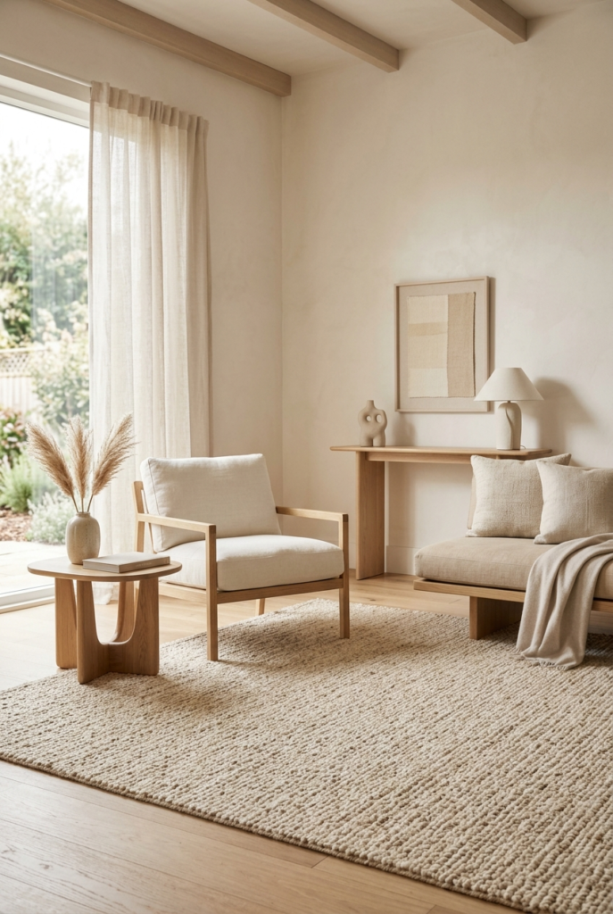
1. Paint all four walls carefully
Cloud Dancer works surprisingly well across all four walls in larger rooms. The space feels open without looking cold.
Smaller rooms are trickier though. I tried it once in a narrow guest room and the space ended up feeling oddly empty. Painting one wall in a slightly warmer beige helped immediately.
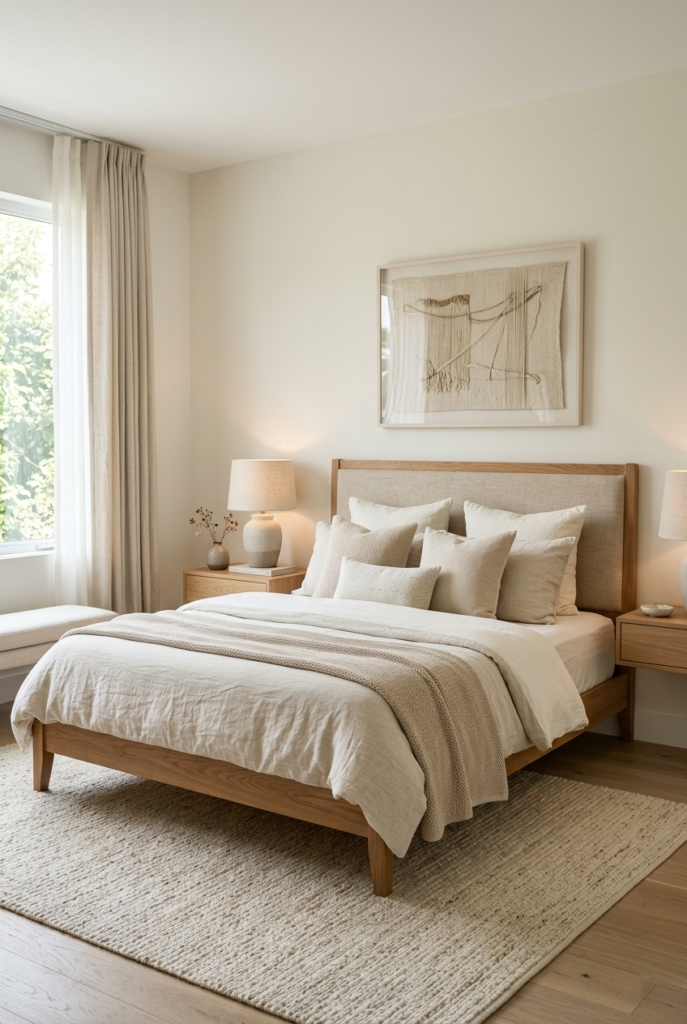
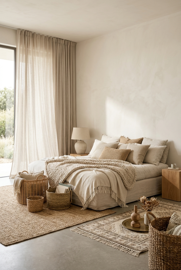
2. Use it behind the bed
A Cloud Dancer wall behind the bed creates a soft backdrop without stealing attention from the furniture.
Medium wood tones looked best here for me. Very dark bed frames felt too sharp against the lighter wall and the contrast became distracting after a while.
3. Try it on the ceiling
This was one of the better surprises.
Using Cloud Dancer on the ceiling made the room feel brighter without creating that plain builder-grade white ceiling look. The slight warmth in the shade helps a lot.
I would still keep the walls slightly darker though so the room keeps some depth.
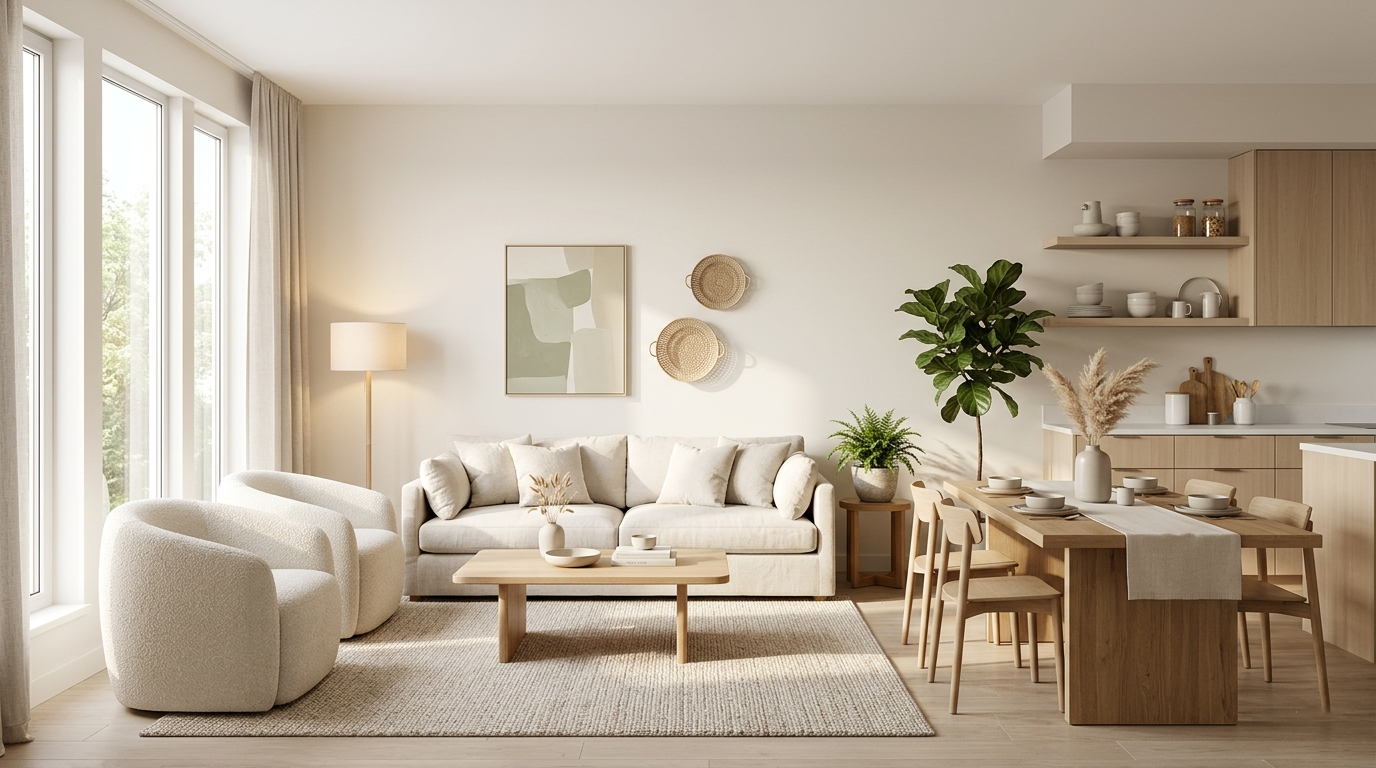
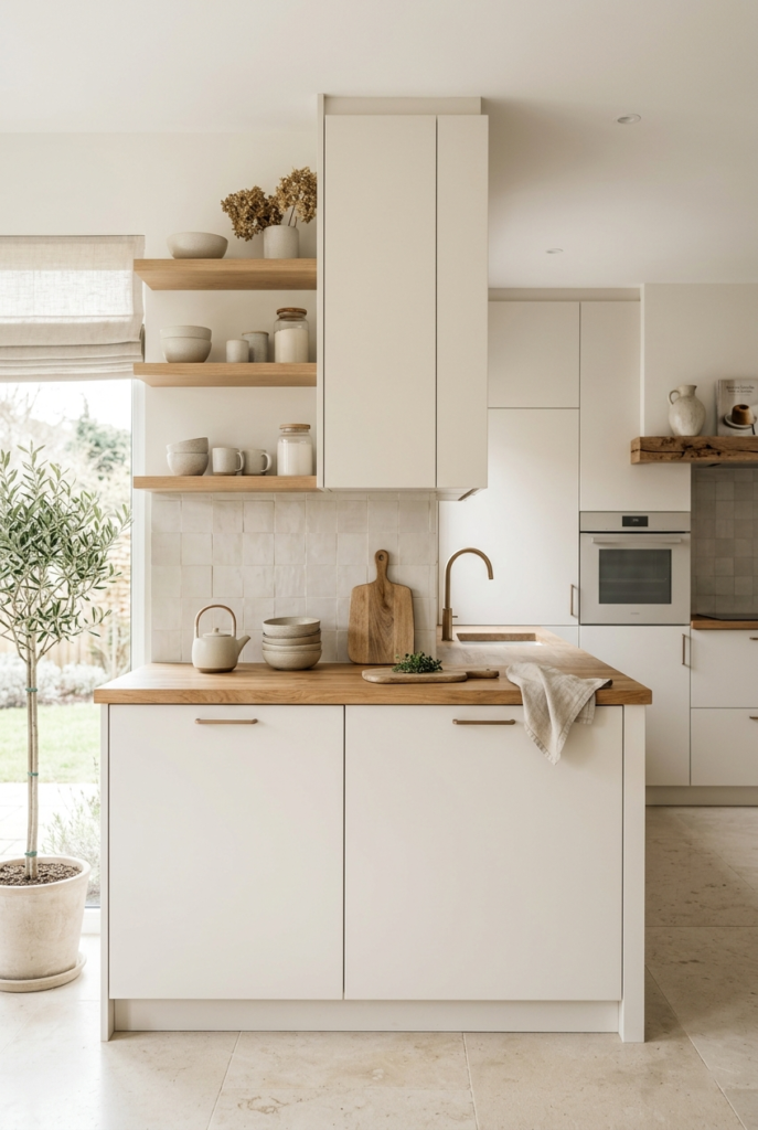
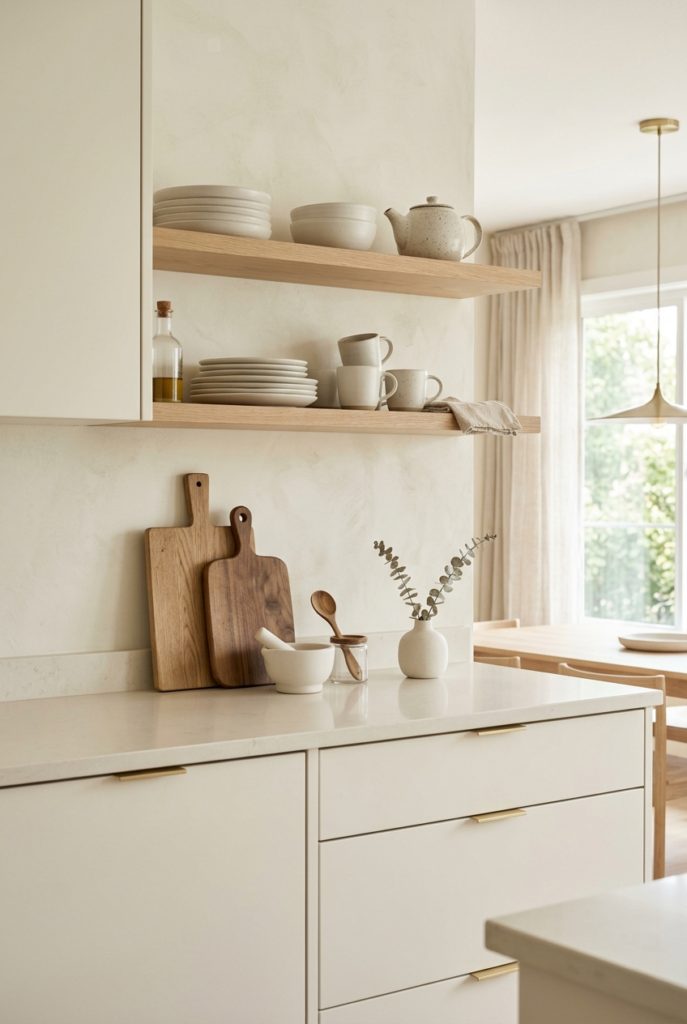
4. Refresh kitchen cabinets
This color works beautifully on kitchen cabinets if the rest of the kitchen is kept fairly simple.
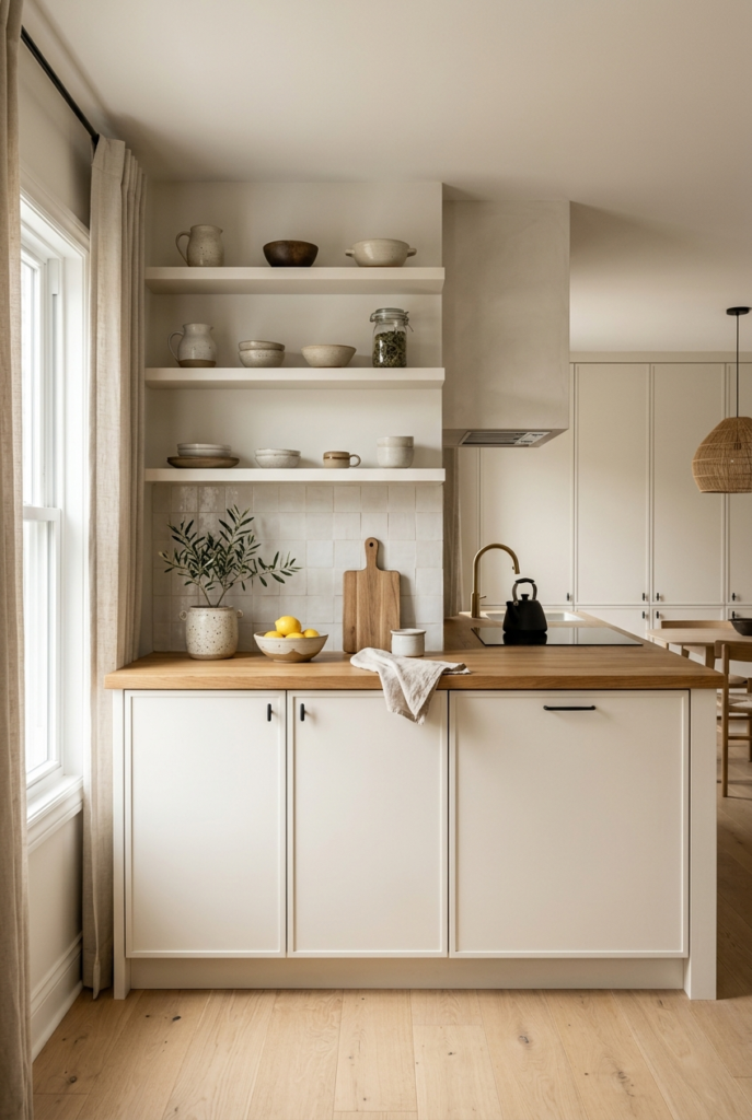
Wood countertops looked especially good next to it. Matte hardware also worked better than shiny finishes. I tested a few reflective silver handles at first and they made everything feel colder than I wanted.
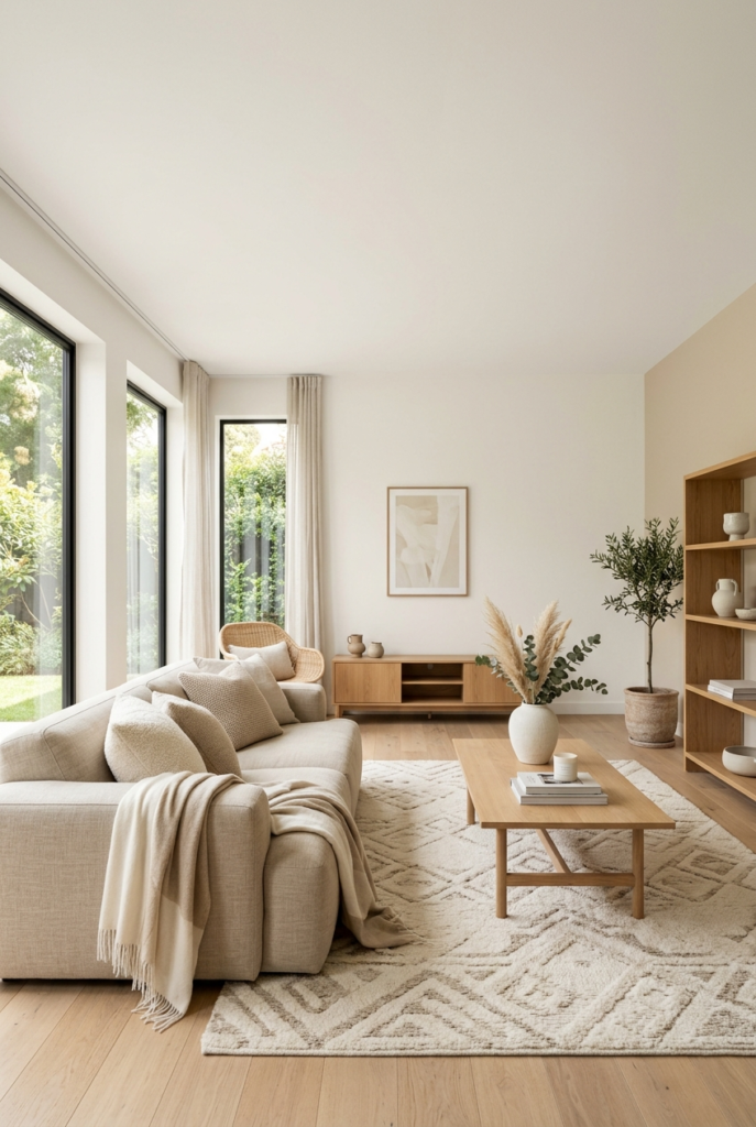
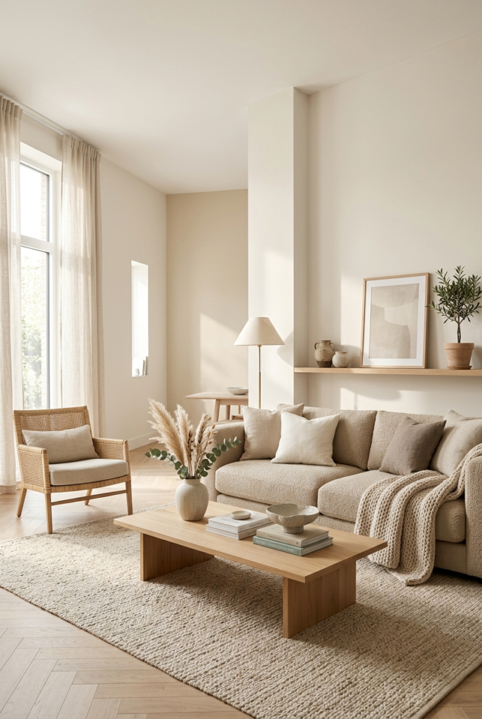
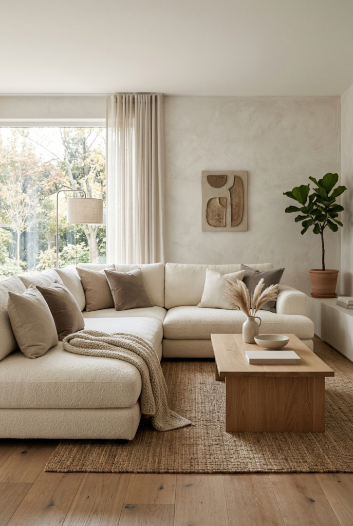
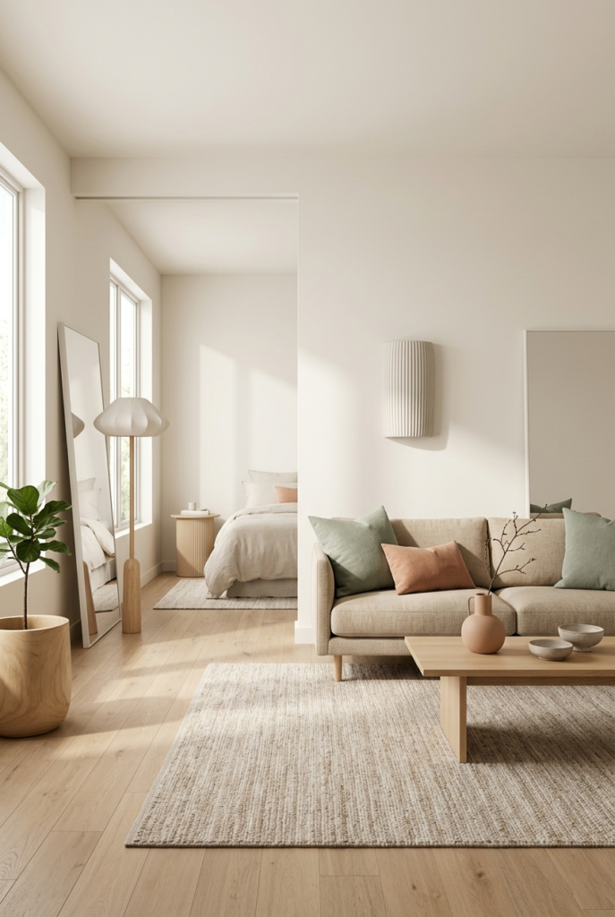
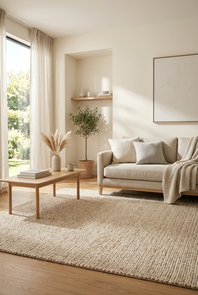
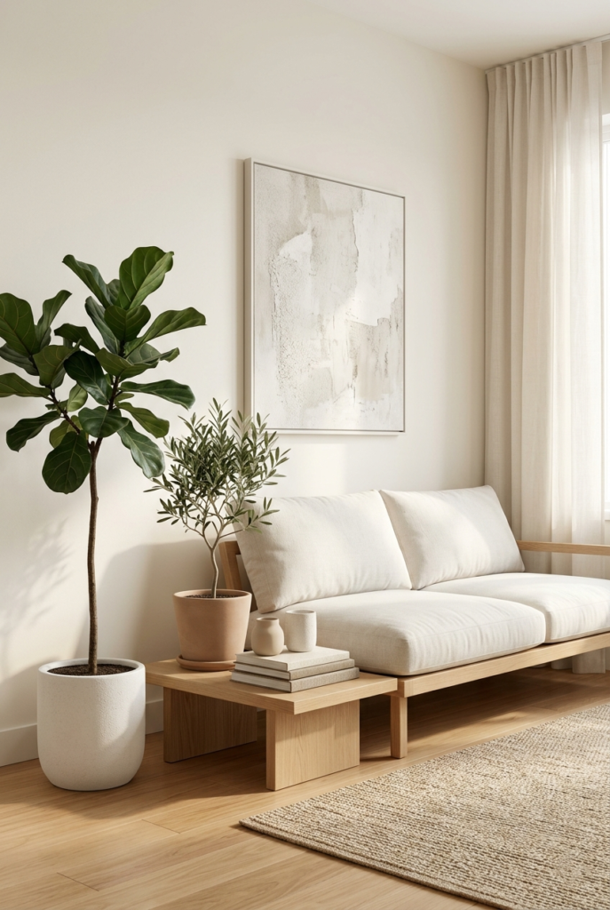
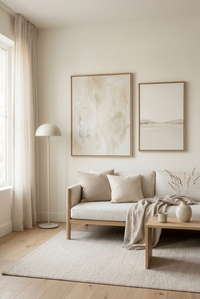
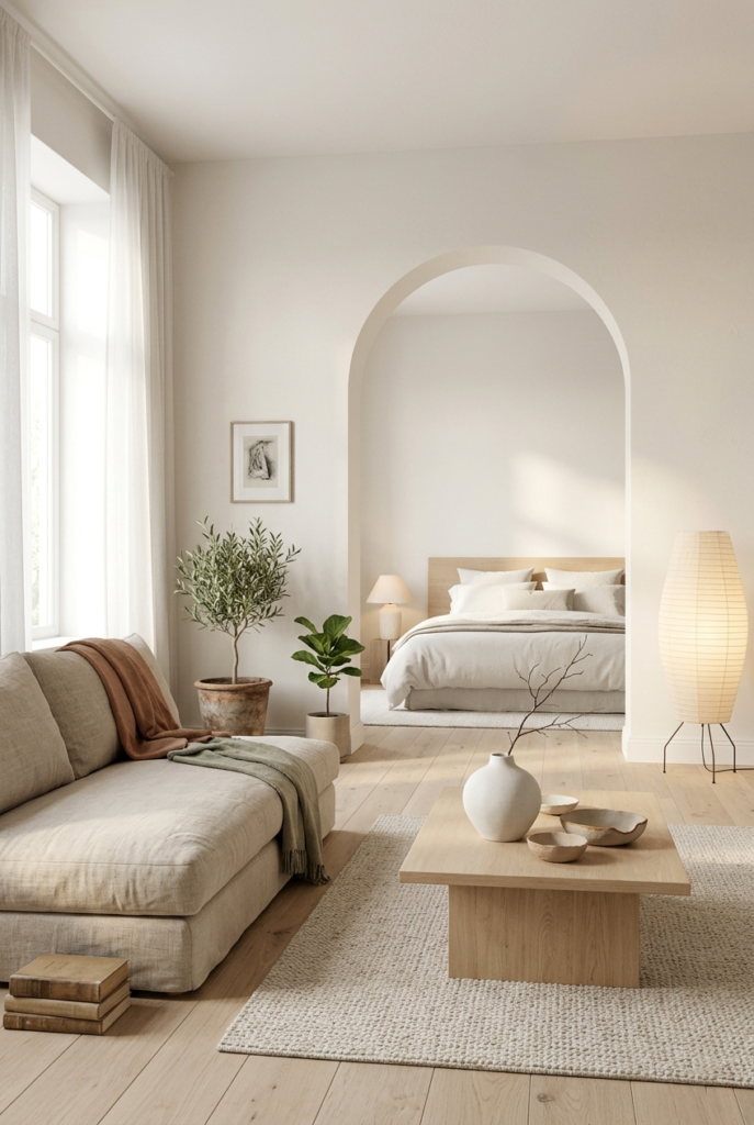
5. Use it on a large sofa
A sofa in Cloud Dancer feels softer and easier to maintain than pure white furniture.
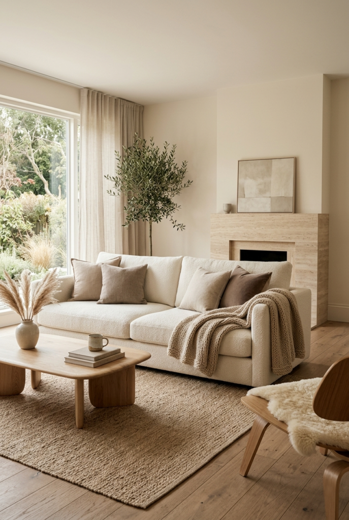
That slight warmth hides small marks better than expected. Bright colorful cushions were not my favorite pairing though. Softer shades looked much more natural beside it.
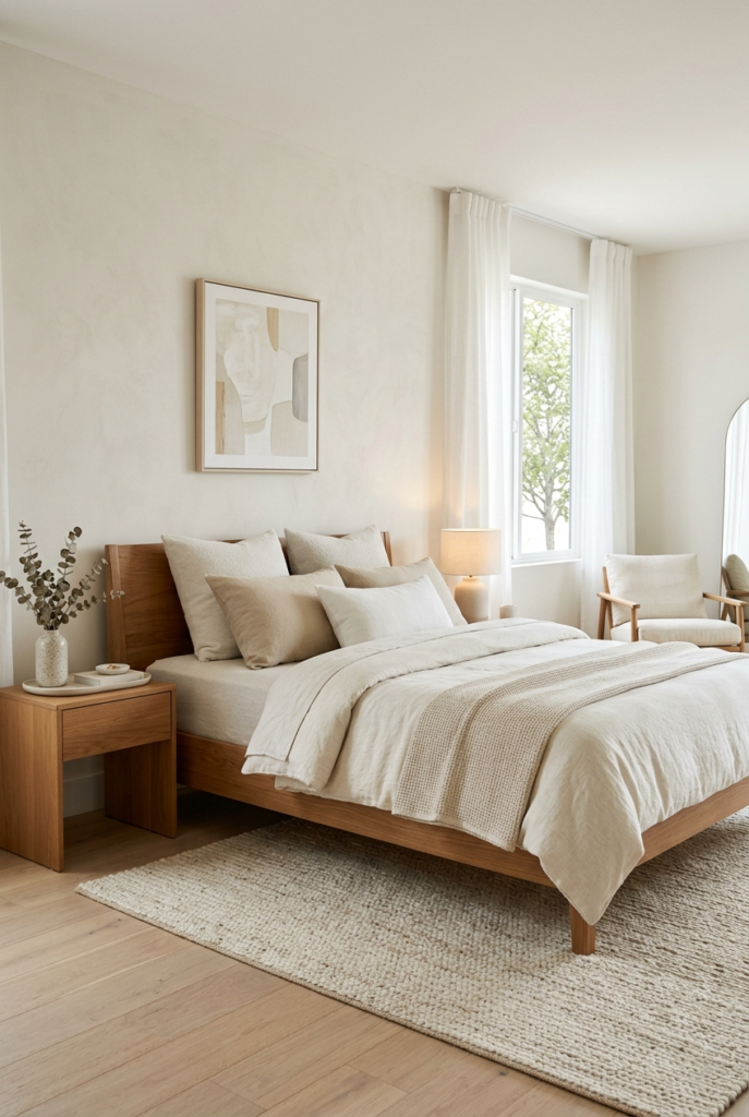
6. Try an upholstered headboard
A headboard in Cloud Dancer changes the bedroom quietly but noticeably.
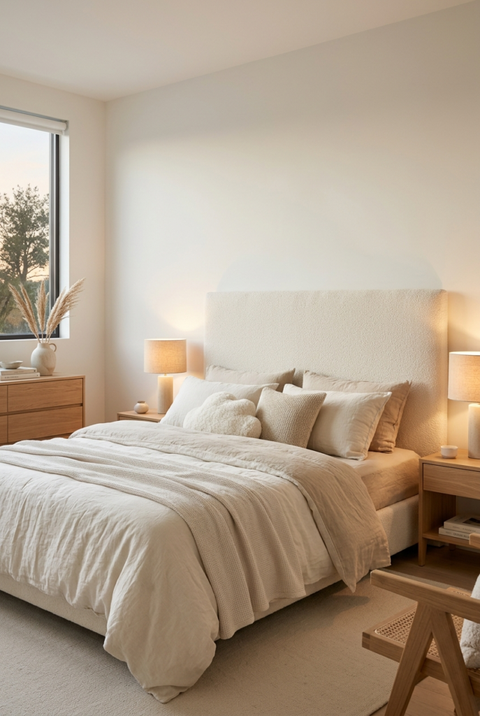
One thing I learned quickly was not to pair it with very bright white bedding. The difference between the two whites becomes obvious at night under warm lighting.
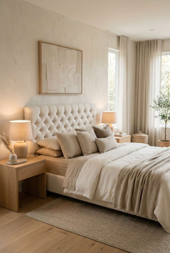
Cream and soft beige bedding worked much better.
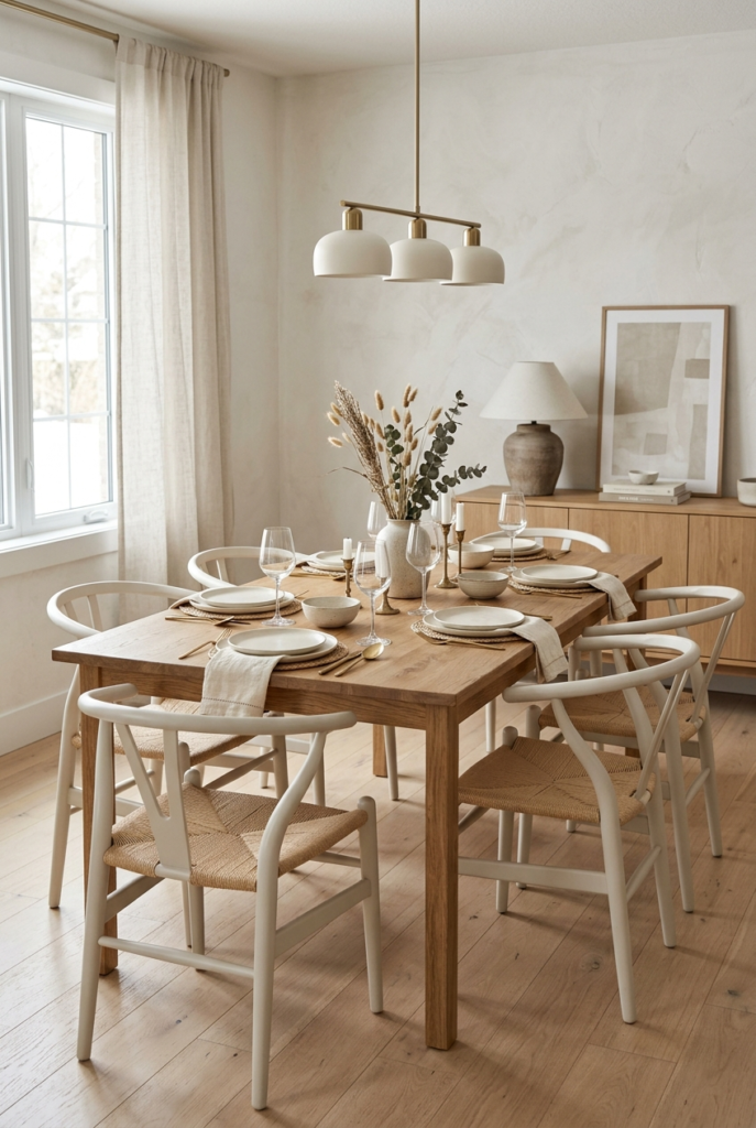
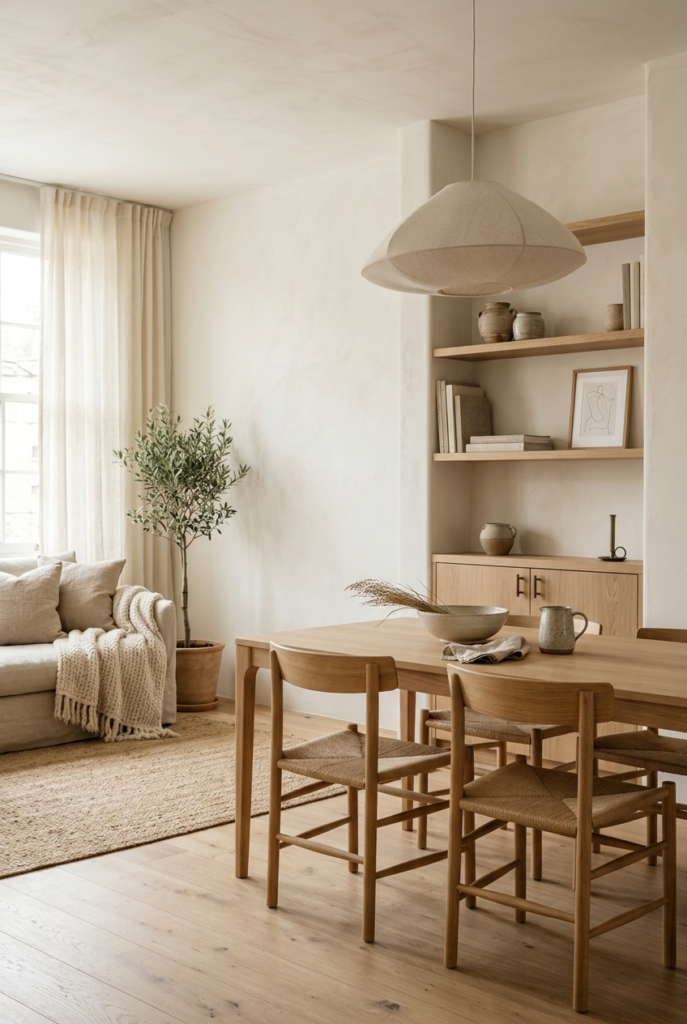
7. Paint dining chairs instead of replacing them
Painting old dining chairs in Cloud Dancer gave my dining area a fresh look without changing the whole setup.
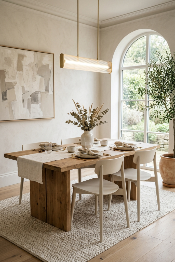
I kept the dining table in natural wood because too many pale surfaces together started looking flat during actual meals.
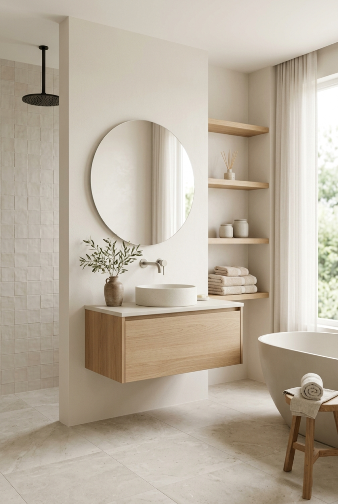
8. Use it in bathrooms carefully
Bathrooms suit this color surprisingly well.
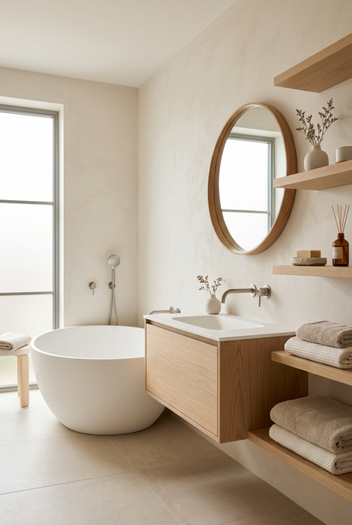
The walls looked clean without feeling too sharp. Light wood shelves and matte tiles helped keep everything relaxed.
Glossy tiles were a different story. They reflected too much light and pushed the color toward a colder white.
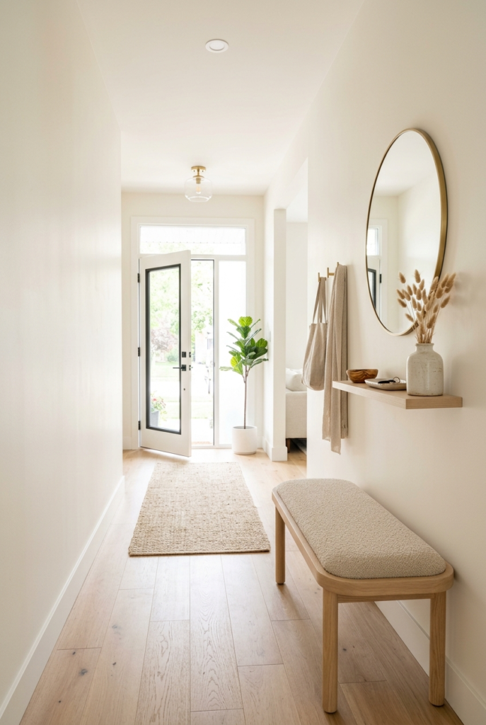
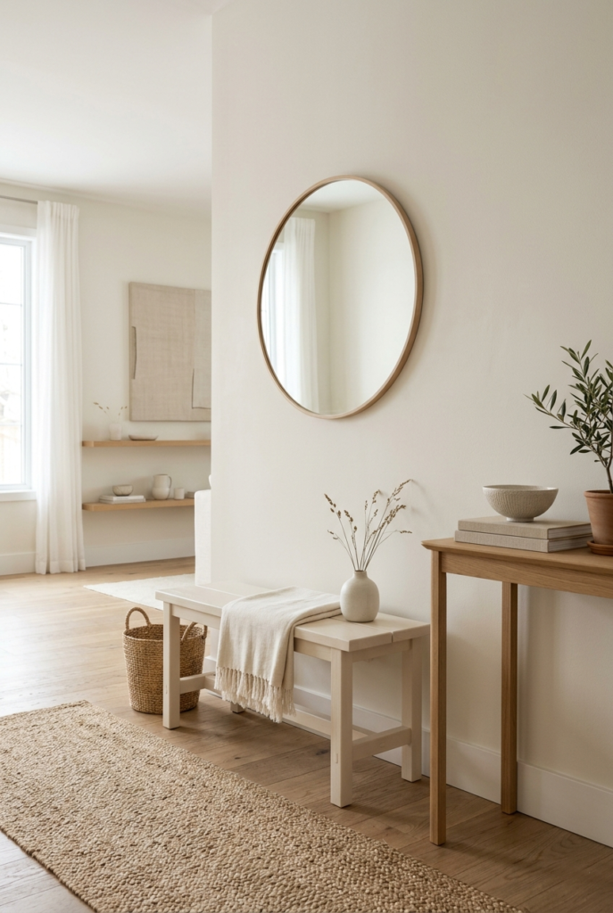
9. Brighten the entryway
Cloud Dancer works nicely in narrow entryways because it reflects light without feeling overly bright.
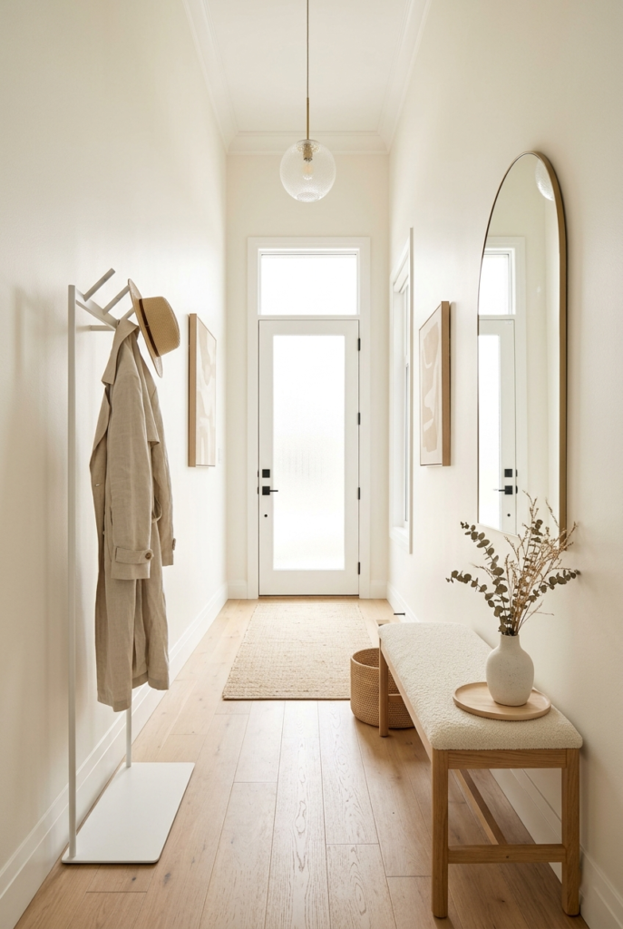
I noticed darker storage benches near the floor made the hallway feel shorter. Lighter furniture kept the effect working better.
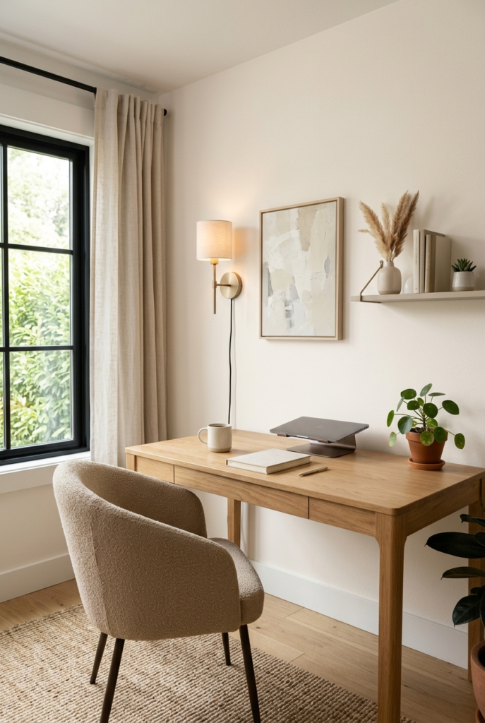
10. Keep home offices balanced
One wall in Cloud Dancer is usually enough for a home office.
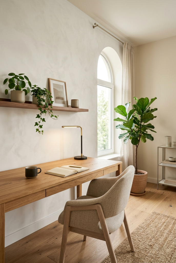
I tried using it across the entire room once and after a few days the space started feeling too washed out during long work hours. A wooden desk and a few plants helped bring some balance back.
11. Pair it with light oak
Light oak and Cloud Dancer naturally work well together.
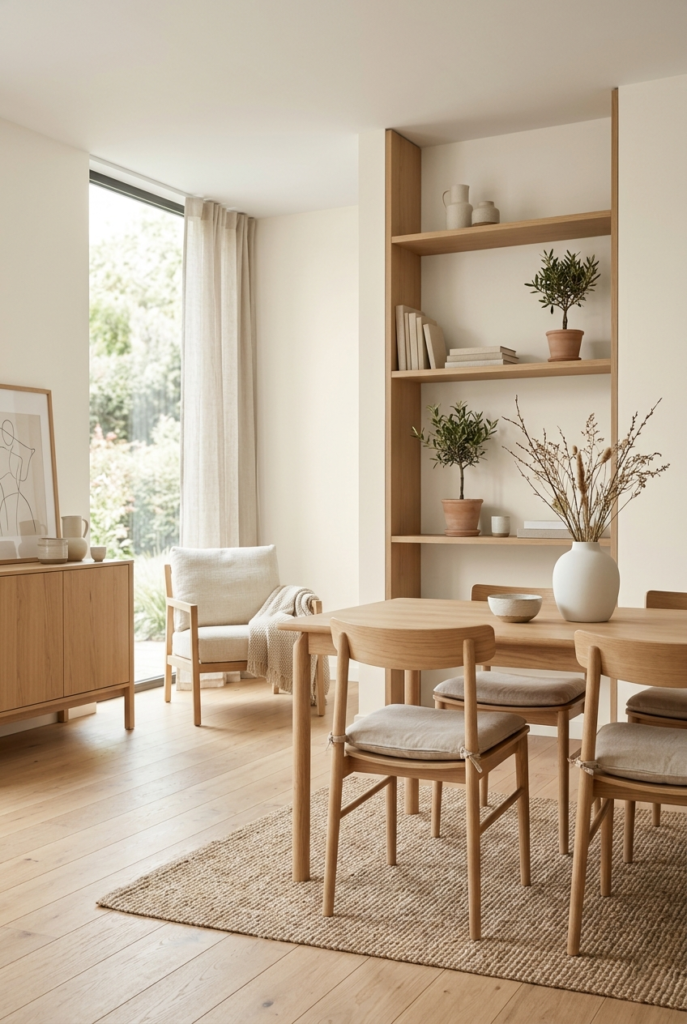
The warmth in both materials feels connected without trying too hard. Dark walnut looked okay in smaller amounts, but large dark furniture pieces felt heavier than expected beside this color.
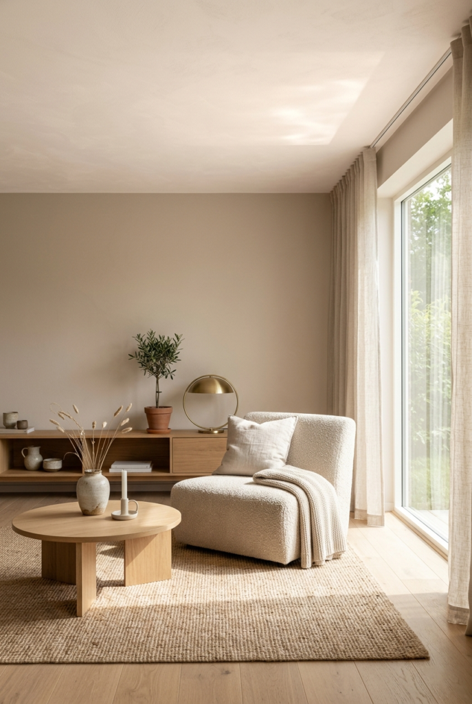
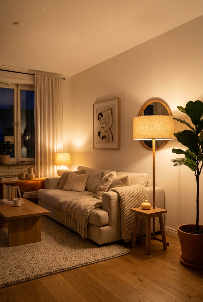
12. Focus on texture
This color becomes much more interesting when texture is involved.
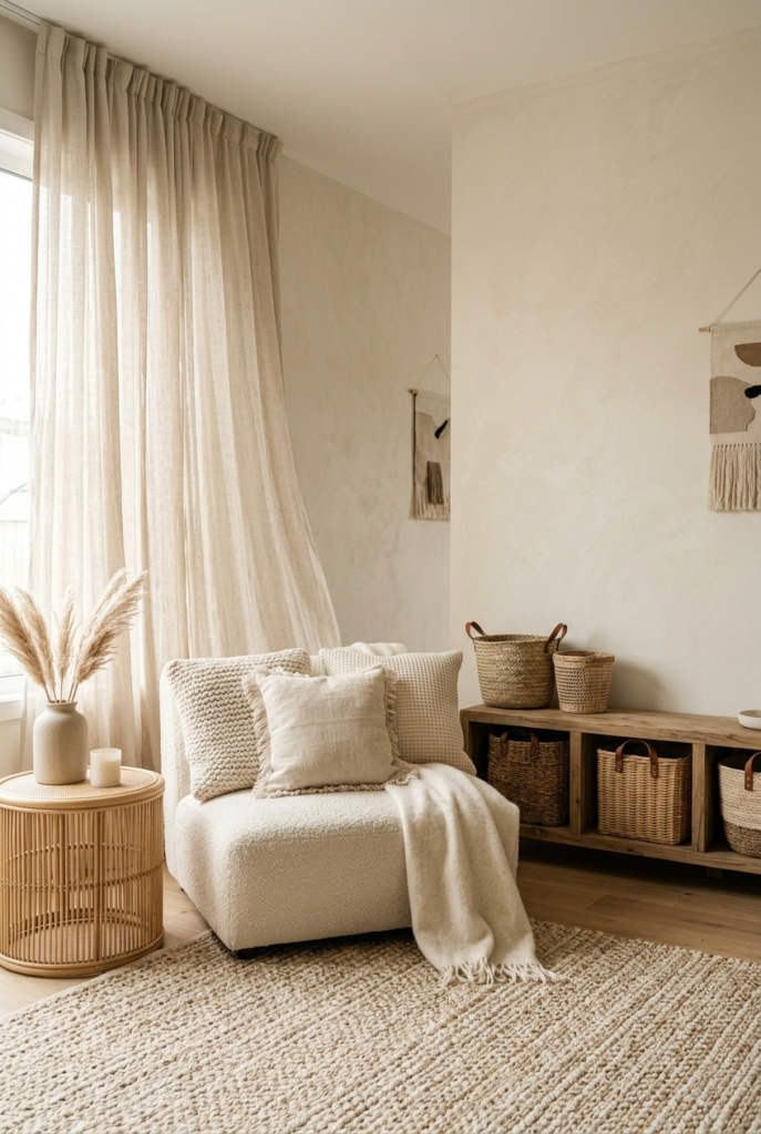
Linen curtains, woven baskets, and softer fabrics stand out nicely against it. Smooth shiny surfaces felt slightly off in comparison.
The more natural the materials looked, the better the room turned out overall.
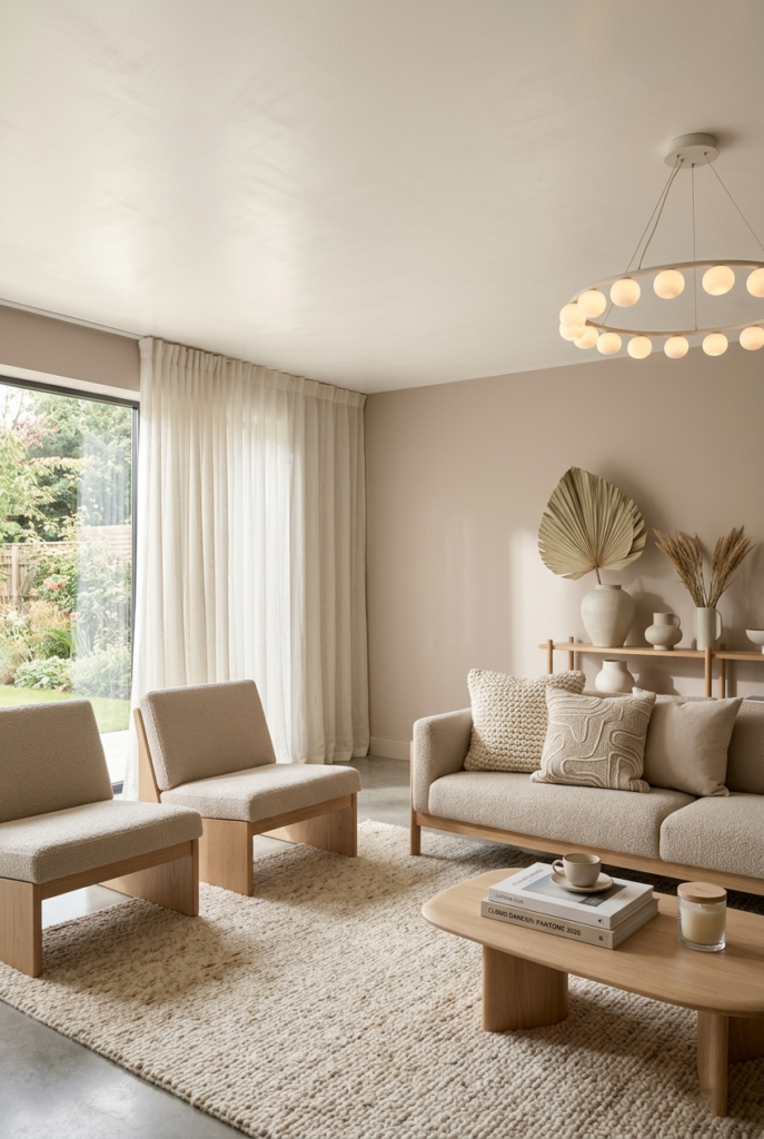
13. Keep accent colors muted
One mistake I made early was adding strong bright colors because I thought the room needed energy.
It did not.
Muted shades like sage green, sandy beige, and soft terracotta looked far better with Cloud Dancer. Strong colors made the white feel accidental instead of intentional.

14. Switch to warm lighting
Lighting changes this color more than people expect.
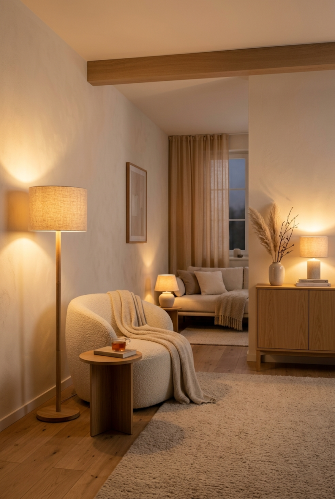
Cool bulbs made it look plain and slightly cold. Warm bulbs completely changed the mood of the room and brought out the softer undertones.
This was probably the simplest change with the biggest difference.
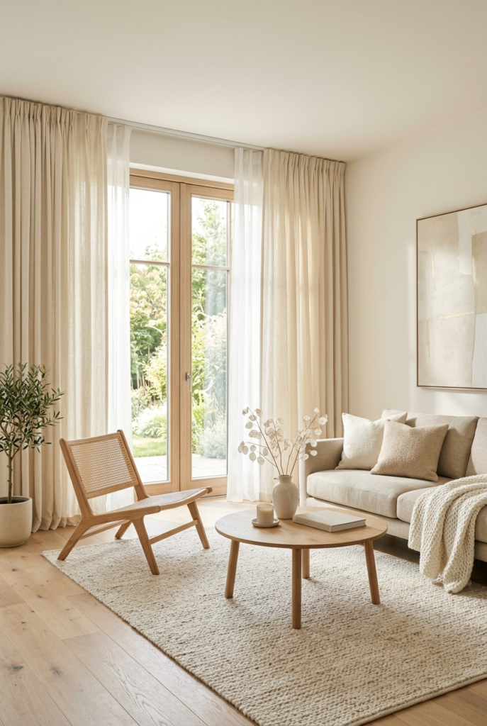
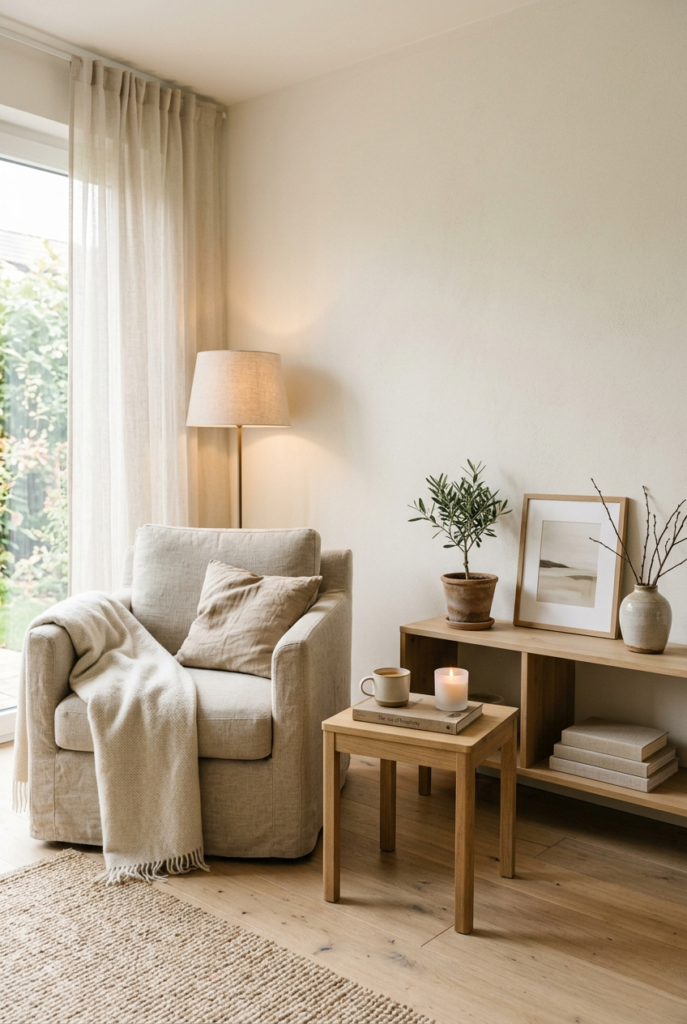
15. Use natural rugs
Natural rugs in warm beige or cream shades work especially well with Cloud Dancer walls.
Pure white rugs looked good for about five minutes and then started feeling impractical. They also blended too much into the walls.
A little contrast helped the room feel more grounded.
16. Choose softer curtains
Linen or cotton curtains worked best in my experience.
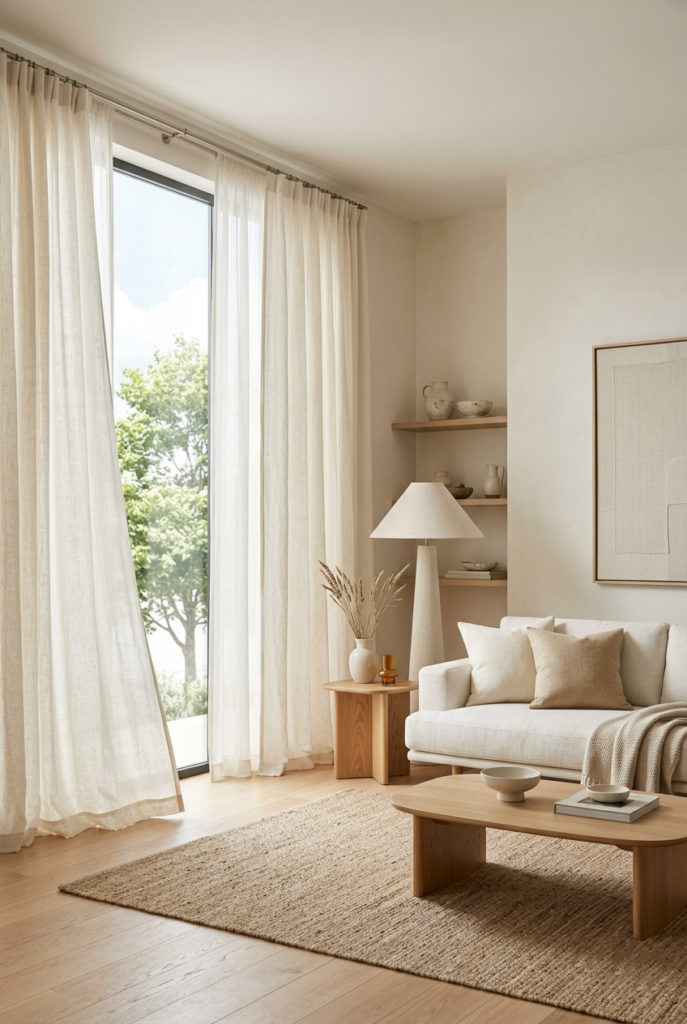
Heavy dark curtains made the walls feel dull during the day. Lighter fabrics kept the room feeling open without making it too bright.
Layering sheer curtains underneath helped at night without changing the daytime look.
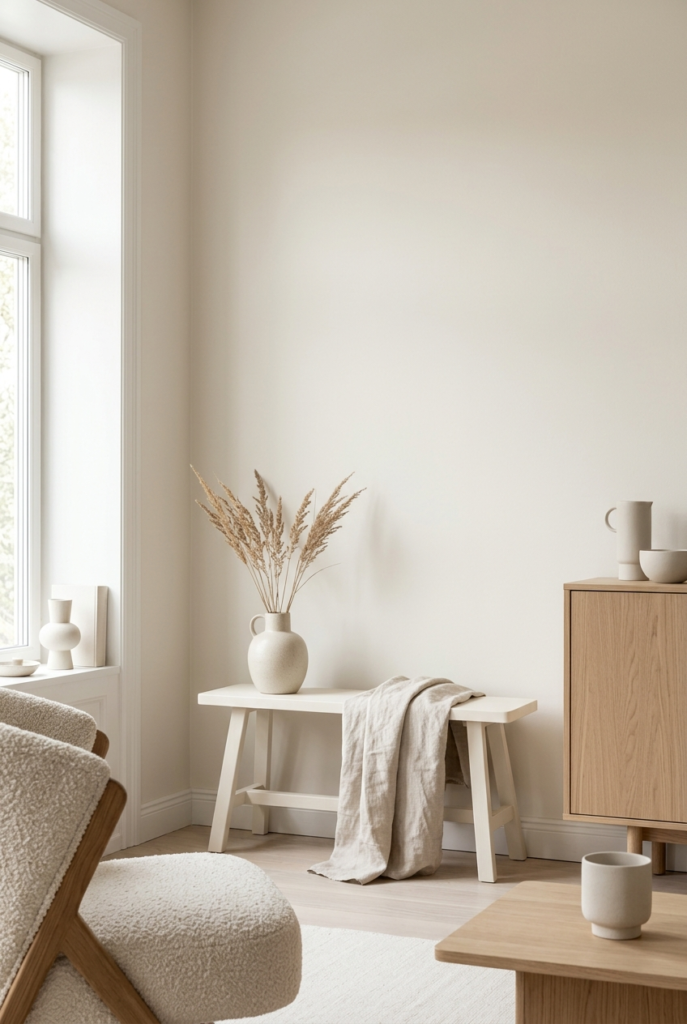
17. Test the color on small furniture first
If you are unsure about using Cloud Dancer on walls, start with smaller furniture pieces first.
I painted a small bench before touching the walls and it helped me understand how the color behaved in different lighting throughout the day.
Honestly, that probably saved me from repainting an entire room later.
18. Add plants carefully
Plants look very good against Cloud Dancer because the green stands out naturally.
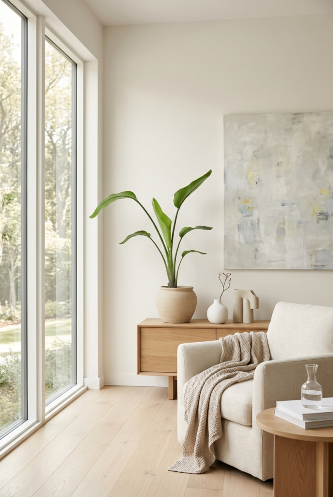
Simple pots in clay, beige, or soft white worked best for me. Dark glossy pots felt too heavy beside such a soft color.
19. Keep wall art simple
Simple artwork looked much better than busy gallery walls.
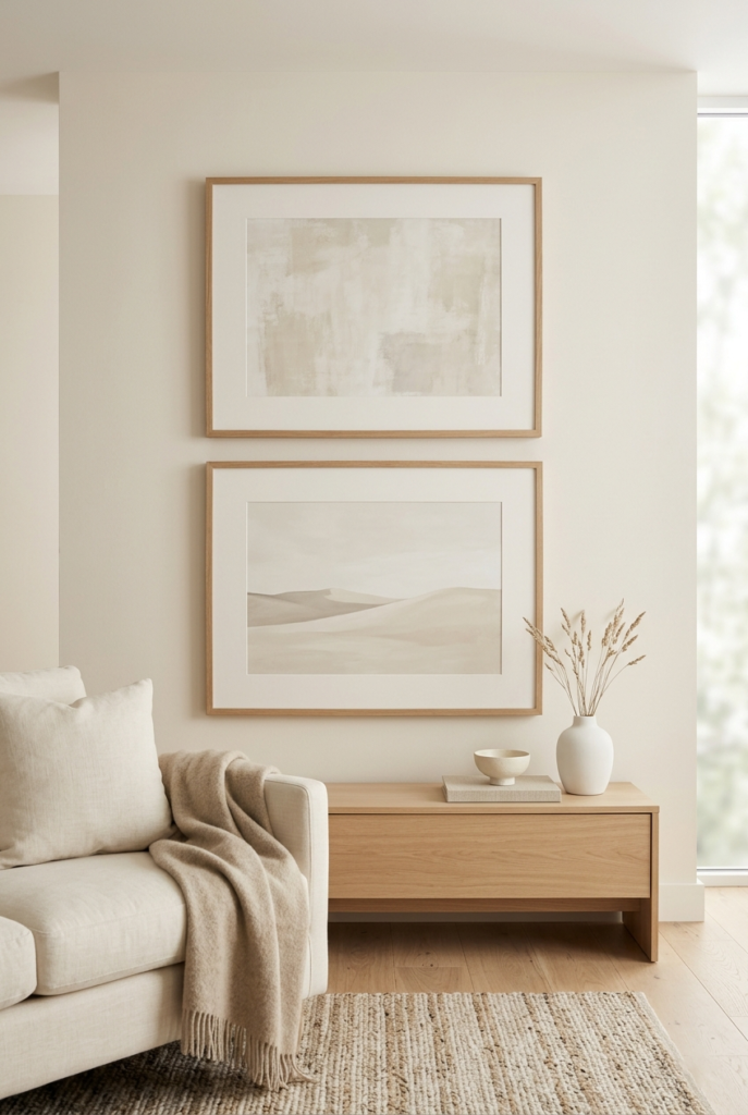
A few larger pieces with space around them gave the room breathing room. Once I tried mixing too many frame styles together and the calm feeling disappeared almost immediately.
20. Match kitchen accessories properly
Off-white plates and matte ceramics layered much better with Cloud Dancer than bright white dishes.
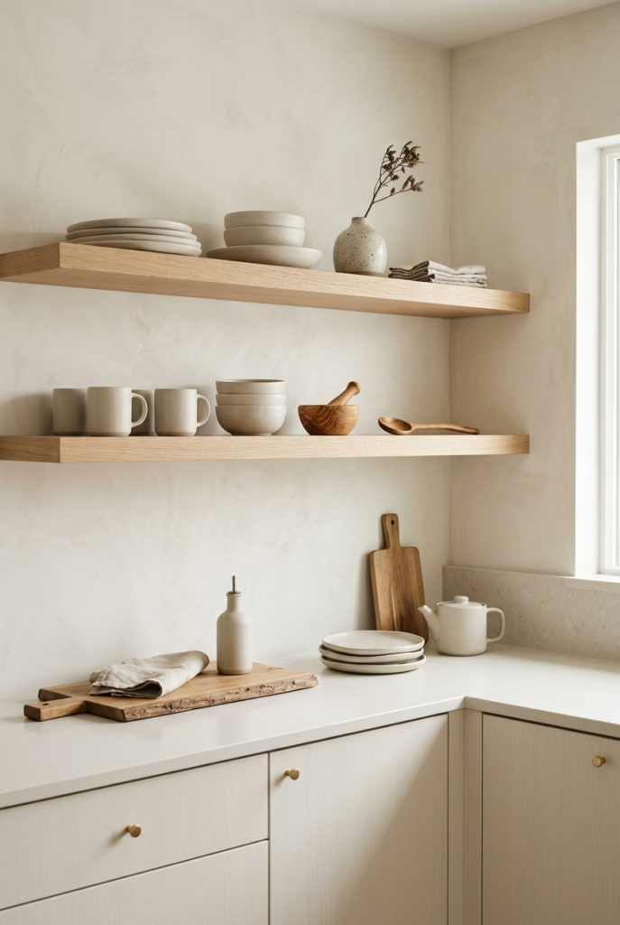
Wood serving boards also helped break up the lighter surfaces without making the kitchen feel crowded.
Final thoughts
Working with the pantone color of the year 2026 taught me that softer colors depend heavily on what surrounds them.
Cloud Dancer is simple, but it is not completely effortless. Some rooms work with it instantly while others need small adjustments before everything settles properly.
The best results usually came when I stopped trying to perfect every corner and just let the room breathe a little.